Defining the problem, conducting interviews, paper and digital wireframing, low and high-fidelity prototyping, conducting usability studies, synthesizing findings, accounting for accessibility, and iterating on designs
Design an eCommerce app that allows users to conveniently order quality dog food at a budget-friendly price. Puppr will be an organic dog food brand that strives to provide high quality food for dogs. They will offer competitive pricing and ensure ordering is quick and easy to complete.
Understanding the User
Responsibilities
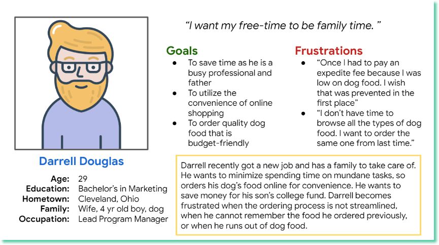
Meet the user: Persona
Darrell is a busy professional who needs to conveniently and easily order dog food at a budget-friendly price because he wants to have more family time and save money for his son’s college education.
User Flow
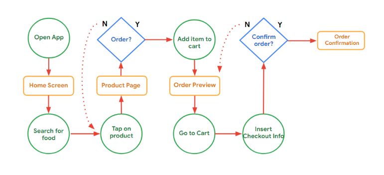
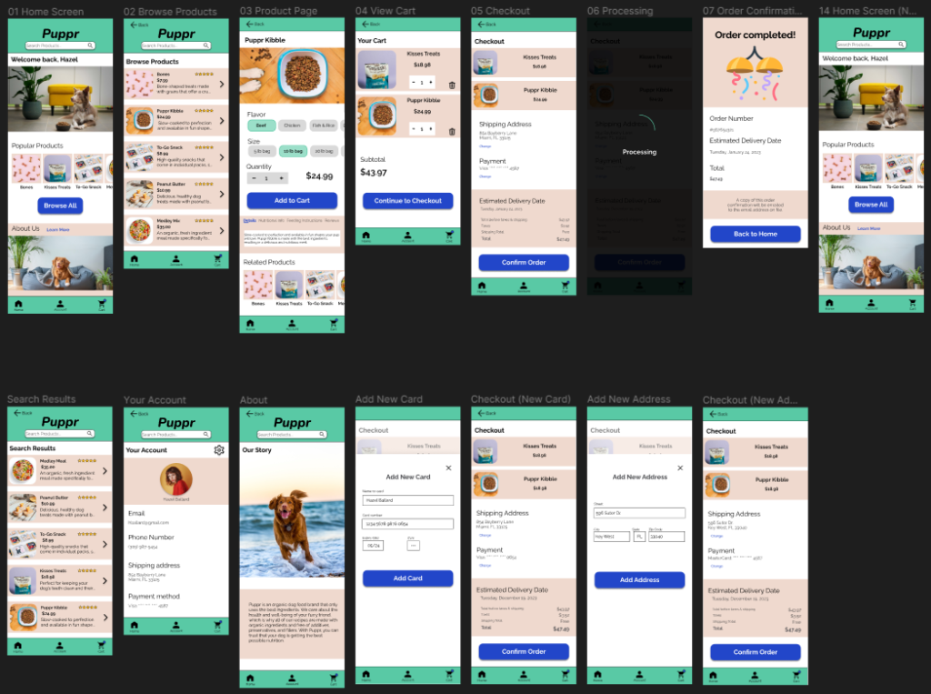
The following diagram shows the flow of the app that the user will follow to successfully complete checkout.
Note: “Search for food” could also be “browse for food”, depending on the route taken by the user
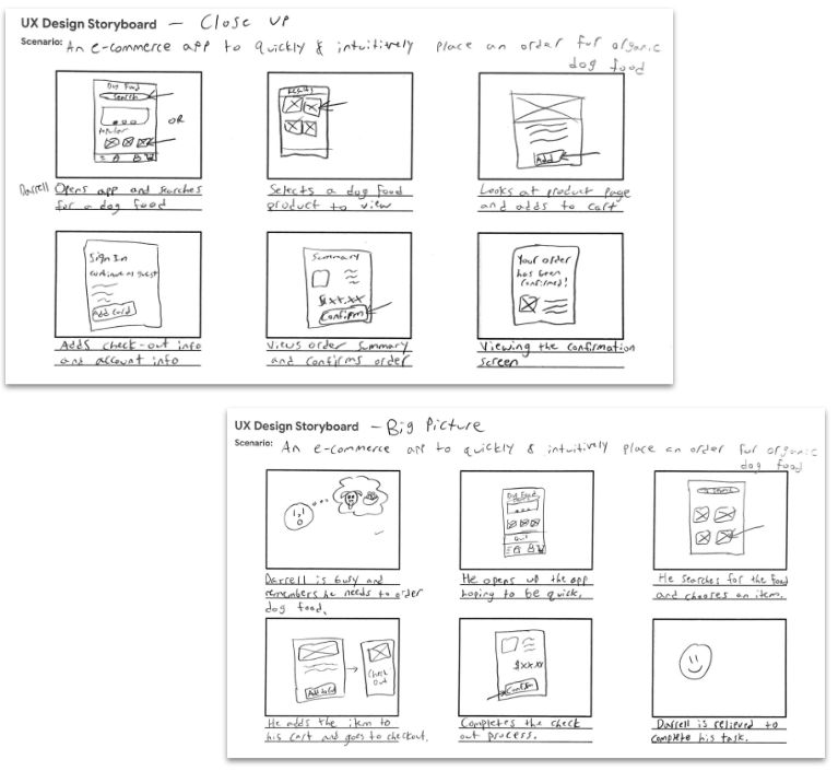
Storyboards
Both a “close-up” and a “big picture” storyboard were created and used to better empathize with the user and visualize the path they would take to successfully complete their task.
Starting the Design
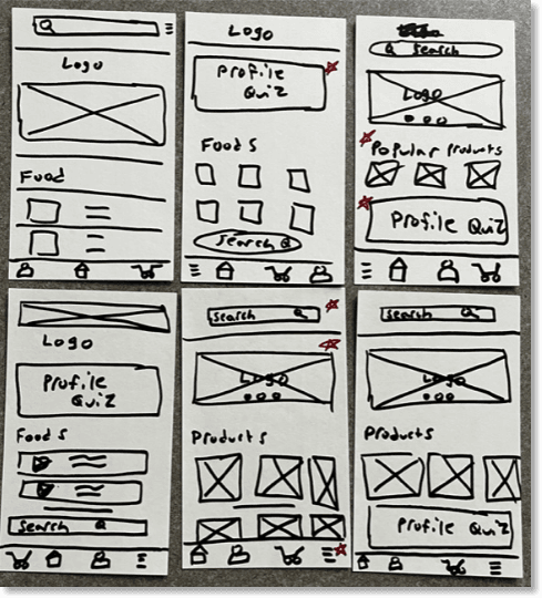
Paper Wireframes
Taking the time to draft iterations of each screen of the app on paper ensured that the elements that made it to digital wireframes would be well-suited to address user pain points. For the home screen, I prioritized options to quickly find products to help users save time.
Note: Stars were used to mark the elements of each sketch that would be used in the initial digital wireframes.
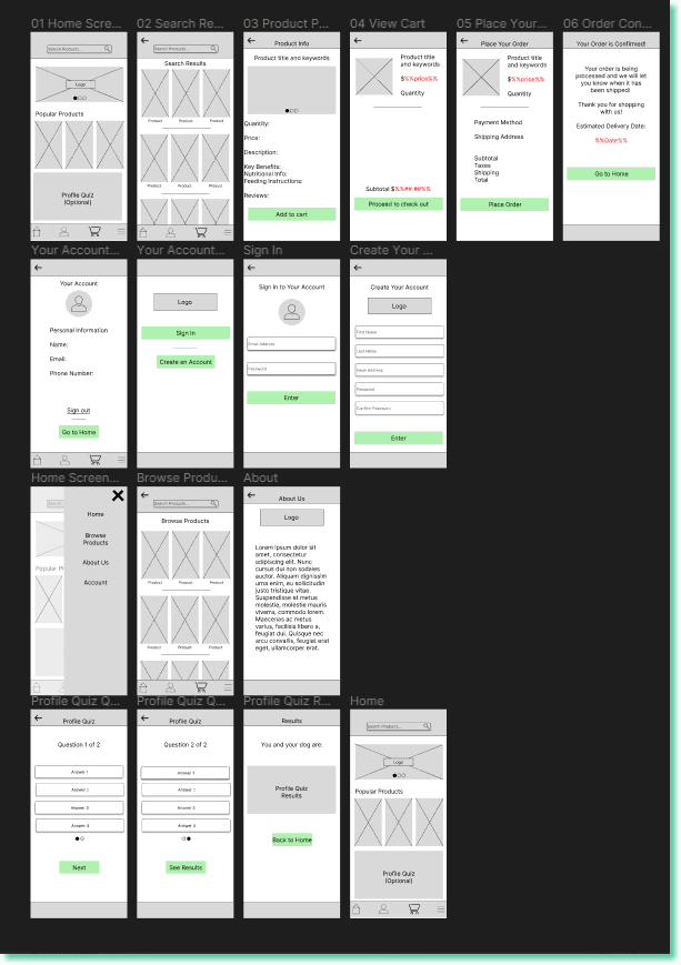
Digital Wireframes
As the initial design phase continued, I made sure to base screen designs on feedback and findings from the user research. Easy navigation was a key user need to address in the designs.
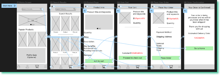
Low-fidelity Prototype
Using the completed set of digital wireframes, I created a low-fidelity prototype. The primary user flow I connected was searching a product and completing check out.
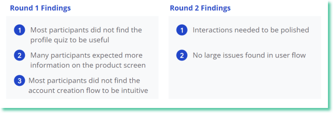
I conducted two rounds of usability studies. Findings from the first study helped guide the designs from wireframes to mockups. The second study used a high-fidelity prototype and revealed what aspects of the mockups needed refining.
Refining the Design
Mockups
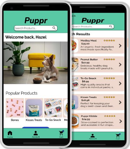
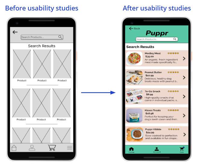
Early designs allowed for some customization, but after the usability studies, I added additional information to the product search results page. I also revised the design so users could see a bit of the product description, the rating, and an icon inviting further interaction.
High-fidelity Prototype
The final high-fidelity prototype presented cleaner user flows, branding, and an overall cleaner presentation which provided an elevated user experience.
Taking the time to draft iterations of each screen of the app on paper ensured that the elements that made it to digital wireframes would be well-suited to address user pain points. For the home screen, I prioritized options to quickly find products to help users save time.
Lessons Learned
Puppr is my first UX project that I was a part of from start to finish. I have experience designing in Axure RP, and I found those skills helped me learn Figma. I also learned that Usability Studies are incredibly valuable for being able to determine potential issues that need to be addressed in the next iteration before moving the project along.